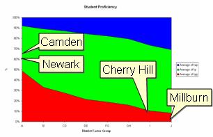
A while back, Enlighten-New Jersey posted an interesting item comparing high school proficiency assessment (HSPA) data from four school districts. Their comparison of Newark and Camden ($15k per student, more than 1/2 not proficient in math or language) to Millburn and Cherry Hill ($11k per student, less than 10% not proficient) made me curious: are there any strong, statistically valid relationships between financial and performance numbers?
Conveniently, the State of New Jersey publishes an annual set of school report cards. Looking up a single school is easy, and the raw data is also available. This database is not for the faint of heart, however. 35 MB of MS Access await; if you choose to download, grab the zipped version. An Excel version is also available.
If you've ever worked with or designed large databases, you'd be appalled at what I found. There are no key fields, and no indices, in any of the 25 tables provided. The same values (County Code, District Code, and School Code) are repeated over and over to identify each row of data. Numerical values are stored as text in some tables. (In the Excel version, ALL values are stored as text). Field names are cryptic: the assessment table includes names like tap, map, fap, wap, bap, aap, nap, hap, oap, gap, sap, mgap, lap, and eap. Each of these contains advanced proficient percentages for a different subgroup of students. It is nearly impossible to use the power of database queries to analyze this data.
Fortunately, I've finally found some time to look at the data and pull out a few interesting comparative charts. I decided to start out looking at the elementary school Assessments of Skills and Knowledge (ASK3 & ASK4), Grade Eight Proficiency Assessment (GEPA), and High School Proficiency Assessment (HSPA). Enlighten had shown a wide gap in performance between pairs of Abbott and non-Abbott districts with strong negative correlations between spending and performance, and I wanted to understand whether or not these were just extreme examples of indicative of a trend. Instead of per-pupil spending, however, I decided to look first at the staff information that was available - administrator and teacher salaries and ratios per student. Each of the following graphs shows the relationships between student performance and one of the staff factors. Red indicates the percentage “partially proficient,” i.e., not proficient in the tested material.
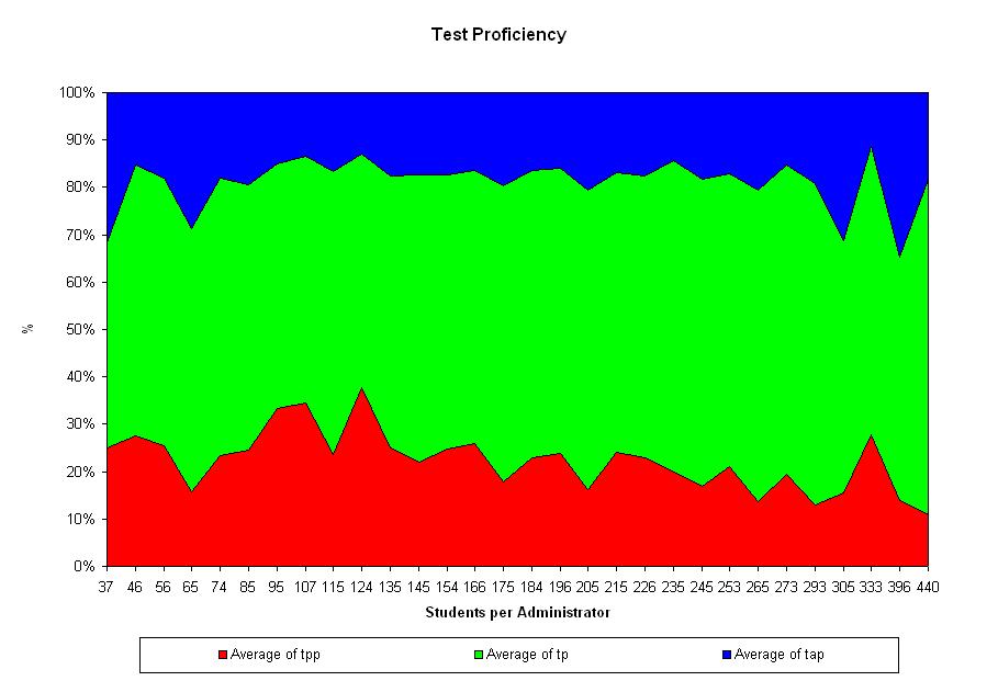
Students per administrator
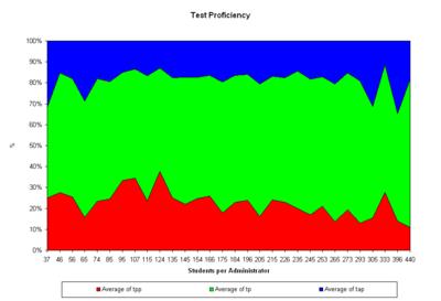
It’s pretty clear from this set of data that there is no difference in student test performance attributable to the number of administrators in the district. Any argument that a district “needs” more non-teaching positions to bolster academic performance should be opposed on the basis of this data.
Average Administrator Salary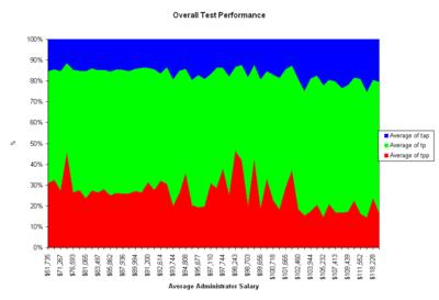
Like the number of students per administrator, there is no clear relationship between administrator salaries and student proficiency.
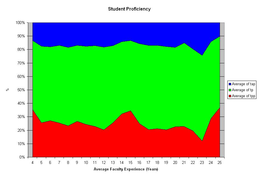
Teacher Experience
Again, no very strong trends present themselves here. There is an interesting spike in failing grades at the top end of the scale, but statistical testing shows it is no different than the overall mean.
Teacher Salary
If you expected teacher salaries to have a strong relationship to overall student performance, you’d be wrong.
Student-Teacher Ratio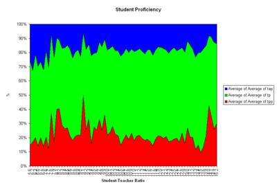
One of the standard claims made by the teachers unions, and many administrators, is that having fewer students per classroom improves performance. In the tables provided by the state, it’s a bit difficult to get at that number and relate it to performance.
The Salary table I’ve been using here includes the ratio of students per administrator (field name
dstad), and the number of faculty per administrator (field name
dfacad), each at the district level. I’ve combined the two, dividing
dstad by
dfacad to arrive at number of students per faculty member. As you can see from the graph, there is no strong relationship between student-teacher ratio and performance. The spike at the high end looks interesting, but again is not statistically significant.
So what does correlate with performance? At a school board meeting a while back, our district superintendent told the board that research had shown the only factor that could be repeatably shown to relate to student performance was the economic means of the community in which they lived.
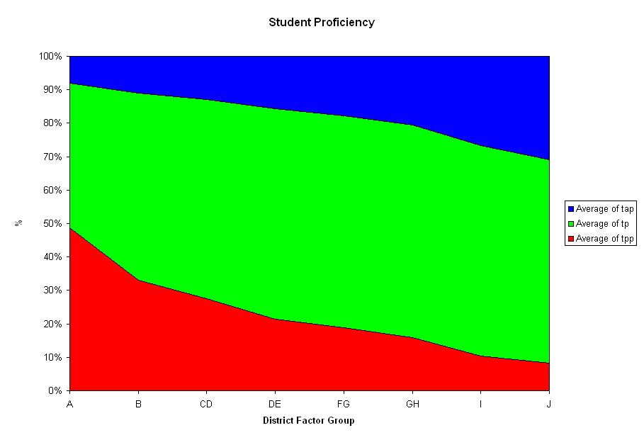
New Jersey classifies school districts by
District Factor Group (DFG), which indicates “the socioeconomic status of citizens in each district.” Based on US Census data, the factors include adult education levels, occupations, population density, income, unemployment, and the percent of residents below the poverty level. DFG is strongly correlated with student performance.
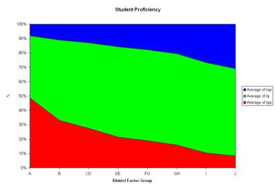
The districts chosen by Enlighten to illustrate the point about spending versus performance are typical for their DFGs. I’ve marked their 03-04 average for partial proficient students on the chart.
How can we solve the differences in performance between schools? I don’t have an answer. But the data tells me that adding staff, finding more experienced teachers, reducing class size, and paying teachers more will not solve the problem. The cause appears to lie in the socio-economic factors in the districts where we live. We have to stop throwing money at the problem.


 The districts chosen by Enlighten to illustrate the point about spending versus performance are typical for their DFGs. I’ve marked their 03-04 average for partial proficient students on the chart.
 How can we solve the differences in performance between schools? I don’t have an answer. But the data tells me that adding staff, finding more experienced teachers, reducing class size, and paying teachers more will not solve the problem. The cause appears to lie in the socio-economic factors in the districts where we live. We have to stop throwing money at the problem.

|